A solid digital art workflow is your personal, repeatable system for getting a project from a spark of an idea to a finished, polished piece. It's not about rigid rules that kill creativity. Instead, think of it as your own custom-built roadmap, designed to make your process smoother, keep your quality consistent, and cut down on that frustrating creative friction we all face.
What a Modern Digital Art Workflow Looks Like
Let's be real—a chaotic process can kill even the most brilliant ideas. Just "winging it" feels great for a moment, but it almost always leads to wasted hours, wildly inconsistent results, and that soul-crushing feeling of burnout. A good workflow is the antidote. It’s a framework that frees up your mental energy to focus on what you actually love: creating.
This is what separates a hobby from a professional, sustainable practice. It’s the difference between just hoping for a great result and actually engineering one. For a growing number of artists, from seasoned pros to ambitious newcomers, having a defined process isn't just a nice-to-have; it's essential.
The digital art market is absolutely booming, which makes efficiency and quality more critical than ever. The market was valued at roughly US$5.8 billion in 2025 and is on track to hit an incredible US$17.72 billion by 2032. That’s a compound annual growth rate of 17.3%. This explosion means more opportunities, but it also means more competition. A reliable workflow is your secret weapon. If you're curious, you can discover more insights about the digital art market's growth and what it means for artists like us.
To truly understand how a workflow functions, it's helpful to see it as a set of core pillars. Each pillar represents a critical stage of the creative process, allowing you to tackle a large project in focused, manageable steps.
Core Pillars of an Effective Digital Art Workflow
| Pillar | Objective | Key Action |
|---|---|---|
| Planning & Ideation | Establish a clear vision and direction. | Brainstorming, gathering references, and creating a project brief or outline. |
| Creation & Execution | Bring the concept to life digitally. | Sketching, line art, color blocking, rendering, and detailing. |
| Refinement & Feedback | Polish the artwork and ensure it meets goals. | Self-critique, making revisions, and incorporating feedback from others. |
| Finalization & Archiving | Prepare and preserve the final piece. | Exporting in various formats, organizing files, and creating secure backups. |
Breaking down your process this way transforms a daunting task into a series of achievable milestones. It helps you pour all your focus into one thing at a time, whether that's nailing the initial sketch or perfecting the final render.
A "joy-sparking" workflow is one that energizes you, making the process of creating as rewarding as the outcome. It’s about building a system that aligns with your personality and artistic style, turning what could be a chore into a cherished ritual.
Ultimately, building your own workflow is about giving your creativity the structure it needs to flourish. It provides a reliable foundation without caging your imagination, empowering you to produce your best work, time and time again.
Laying the Groundwork Before You Draw
It’s tempting to jump right in and start sketching, but the best artwork rarely starts with an impulsive first stroke. The most striking pieces I've seen—and created—are almost always the result of solid prep work. This initial planning phase is what turns a fuzzy idea into a clear, actionable plan, giving you a roadmap before you even pick up your stylus.
Think of it like an architect drafting a blueprint. Winging it is a surefire way to hit creative dead ends, waste hours on frustrating revisions, and lose momentum. A little time spent upfront will save you a massive headache later.
From Vague Idea to Solid Concept
Every project begins with that initial spark. But a spark needs oxygen to grow into a real concept. This isn't about waiting around for inspiration to strike; it's an active process. I usually start by just jotting down keywords, themes, and emotions connected to my idea in a simple text file or notebook. Sometimes, a quick mind map can help untangle those thoughts into something more solid.
Once the core idea feels less like a ghost and more like a plan, it's time to gather visual intel. This is where you collect reference images, but be careful. Dumping hundreds of images into a folder isn't inspiration—it's just digital hoarding. The goal is to build a focused mood board that actually guides your artistic choices.
Here's how I keep my reference gathering productive:
- Use a Dedicated Tool: I swear by PureRef. It gives you a single, infinite canvas to drop, scale, and make notes on your images. It keeps everything visible without swamping my desktop.
- Categorize Your Images: Don't just make a visual soup. Group your images. I create little clusters for lighting, color palettes, anatomy poses, clothing textures, and so on. This makes the board a practical tool, not just a pretty collage.
- Set a Timer: The Pinterest and ArtStation rabbit holes are real. I give myself a hard limit, usually 30-60 minutes, to find what I need. This forces me to be decisive and stops me from getting stuck in permanent "research mode."
A well-curated mood board is more than a collection of pretty pictures; it’s a visual contract with yourself. It defines the project's aesthetic and provides a constant point of reference to keep your work consistent and on track.
Creating a Bulletproof Digital Filing System
Nothing kills a creative flow faster than a messy project folder. We've all been there, wasting precious time digging for an older file version or trying to remember where we saved that one perfect texture. A disciplined approach to file organization isn't just for neat freaks; it's a non-negotiable part of a professional digital art workflow.
The trick is to develop a predictable folder structure you can reuse for every single project. It removes the guesswork and makes your whole process feel smoother.
A Real-World Folder Structure Example
Let's say you're starting a new character piece called "Cyber-Ronin." Your top-level project folder could be set up like this:
Project_Cyber-Ronin
01_References/(This is where your PureRef board and raw images live)02_Sketches/(For all the early thumbnails and rough concepts)03_Working_Files/(For your main .psd, .clip, or .procreate files)04_Exports/(Finished JPEGs, PNGs for your portfolio, social media posts, etc.)05_Assets/(Any custom brushes, textures, or 3D models you use for this specific project)
This system keeps every part of your project organized and separate. But the folder structure is only half the battle. You also need a smart file naming convention. This adds clarity and version control right into the filename itself.
A really solid naming system usually includes these pieces:
- Project Name: So you know what it belongs to at a glance.
- Asset Description: Is it a character concept? An environment? A prop?
- Version Number: This is absolutely critical. Use
v01,v02,v03to track your major saves. Trust me, you'll thank yourself later. - Status (Optional): Adding a tag like
_WIP(Work in Progress) or_FINALcan be a lifesaver.
Put it all together, and you get a filename like CyberRonin_CharacterConcept_v03.psd. That one name instantly tells you the project, what's in the file, and how far along it is. It's a small habit that builds incredible efficiency, making your workflow feel less like a chaotic scramble and more like a focused, professional operation.
Choosing the Right Tools for Your Art
Your digital toolkit can make or break your entire creative process. Getting it right feels like the tools are an extension of your own hand, letting ideas flow effortlessly. The wrong setup, however, creates constant friction, turning every project into an uphill battle. The key is to find what truly works for you—your budget, your unique artistic style, and what you’re trying to create.
There's no magic "best" setup for everyone. A concept artist building massive worlds for a video game has completely different needs than an illustrator crafting whimsical characters for Instagram. Let's walk through the main options so you can build a toolkit that feels genuinely empowering.
Finding Your Perfect Hardware Fit
The physical tool you draw with is the most personal part of your digital workflow. It's all about the tactile experience of creation. Your main choices fall into three distinct categories, each with its own feel and benefits.
- Non-Screen Tablets: Think of the classic Wacom Intuos. You draw on a blank pad while looking up at your monitor. This hand-eye disconnect takes some getting used to, but it’s a skill countless pros have mastered. These are usually the most affordable and durable options, making them a fantastic, no-fuss starting point.
- Display Tablets: Devices like a Huion Kamvas or XP-Pen Artist have a built-in screen, letting you draw directly onto your artwork. This creates a much more natural, pen-on-paper feeling that many artists find incredibly intuitive. They still need to be hooked up to a computer, but they beautifully bridge the gap between affordability and a direct drawing experience.
- Standalone Devices: This is your all-in-one category, including powerhouses like the iPad Pro or Samsung Galaxy Tab. They combine the computer and the screen into a single, portable package. The freedom to create literally anywhere is a massive advantage, and apps like Procreate deliver a potent, streamlined experience. The main tradeoff is sometimes raw computing power when compared to a dedicated desktop rig.
The "best" tablet is simply the one that removes the most friction from your creative flow. For one artist, that's the absolute portability of an iPad. For another, it's the sheer power and ergonomic setup of a large display tablet tethered to a beastly PC.
No matter what hardware you choose, the fundamental process of building a sketch remains the same. A structured approach is always your best bet.
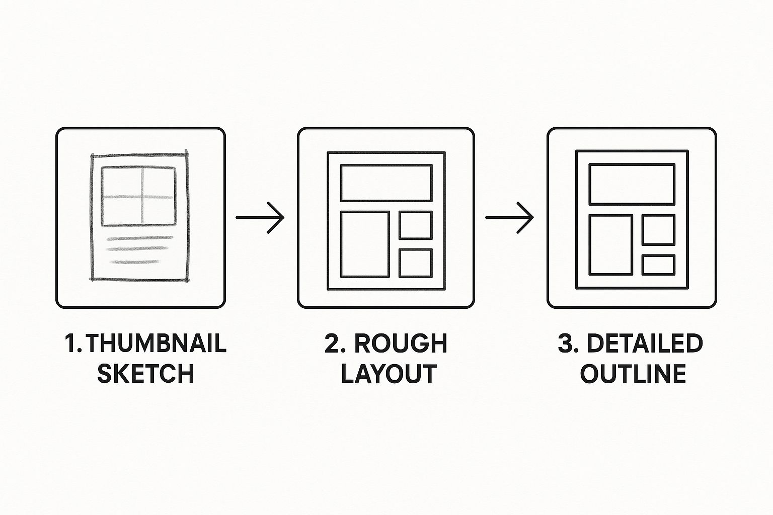
This visual really hammers home how starting with broad ideas and refining them into a solid outline creates a strong foundation for any piece of art.
Navigating the Software Landscape
With your hardware sorted, the software is where your workflow really comes to life. The program you choose dictates everything—from how your brushes feel to how you manage layers and export your final piece. Let's look at the heavy hitters.
Adobe Photoshop is the industry titan for good reason. It's an absolute beast of an application that can do just about anything. Though it started as a photo editor, its incredible brush engine and massive toolkit have made it a go-to for digital painting, concept art, and photobashing. Its versatility is its greatest strength, but the subscription-only model can be a sticking point for some artists.
Clip Studio Paint is a true powerhouse built from the ground up for illustrators and comic artists. Its brush engine is famous for its natural, responsive feel. Better yet, it’s packed with specialized tools—like perspective rulers, panel cutters, and 3D model integration—that are an absolute dream for anyone creating comics or manga. The fact that it’s available as a one-time purchase is a huge plus for many creatives.
Procreate, an iPad exclusive, has won over the art world with its elegant, simple interface and buttery-smooth drawing experience. It’s shockingly powerful for its price and is the perfect choice for artists who value an uncluttered, intuitive workspace. It might not have every single feature of its desktop rivals, but its focused toolset is more than capable of producing professional-grade work.
Matching Tools to Your Workflow
Choosing the right software is a critical decision. To help you decide, here’s a quick breakdown of where each program really shines.
Digital Art Software Comparison
| Software | Best For | Key Strengths | Pricing Model |
|---|---|---|---|
| Adobe Photoshop | Photo Manipulation, Concept Art, General Digital Painting | Unmatched versatility, powerful editing tools, industry standard integration | Subscription |
| Clip Studio Paint | Illustration, Comics, Manga, Animation | Superior brush engine, excellent comic tools, 3D model support | One-time Purchase |
| Procreate (iPad) | Sketching, Painting, Illustration on the Go | Intuitive interface, excellent performance, portability, affordable | One-time Purchase |
Ultimately, the goal is to align your tools with your actual artistic needs. A concept artist who regularly integrates 3D models and photo textures into their work will likely feel most at home with Photoshop and a large display tablet. On the other hand, an illustrator who is always on the move and values a quick, fluid sketching tool might find their soulmate in an iPad Pro running Procreate.
Picking the right combination is a massive step toward building an efficient digital art workflow. If you want to explore more specialized apps, you can check out our guide on various creative tools that can perfectly complement your main setup. Don't be afraid to experiment—the real goal is to find the hardware and software that make creating art feel as natural and fun as possible.
2. Bringing Your Vision to Life on the Canvas
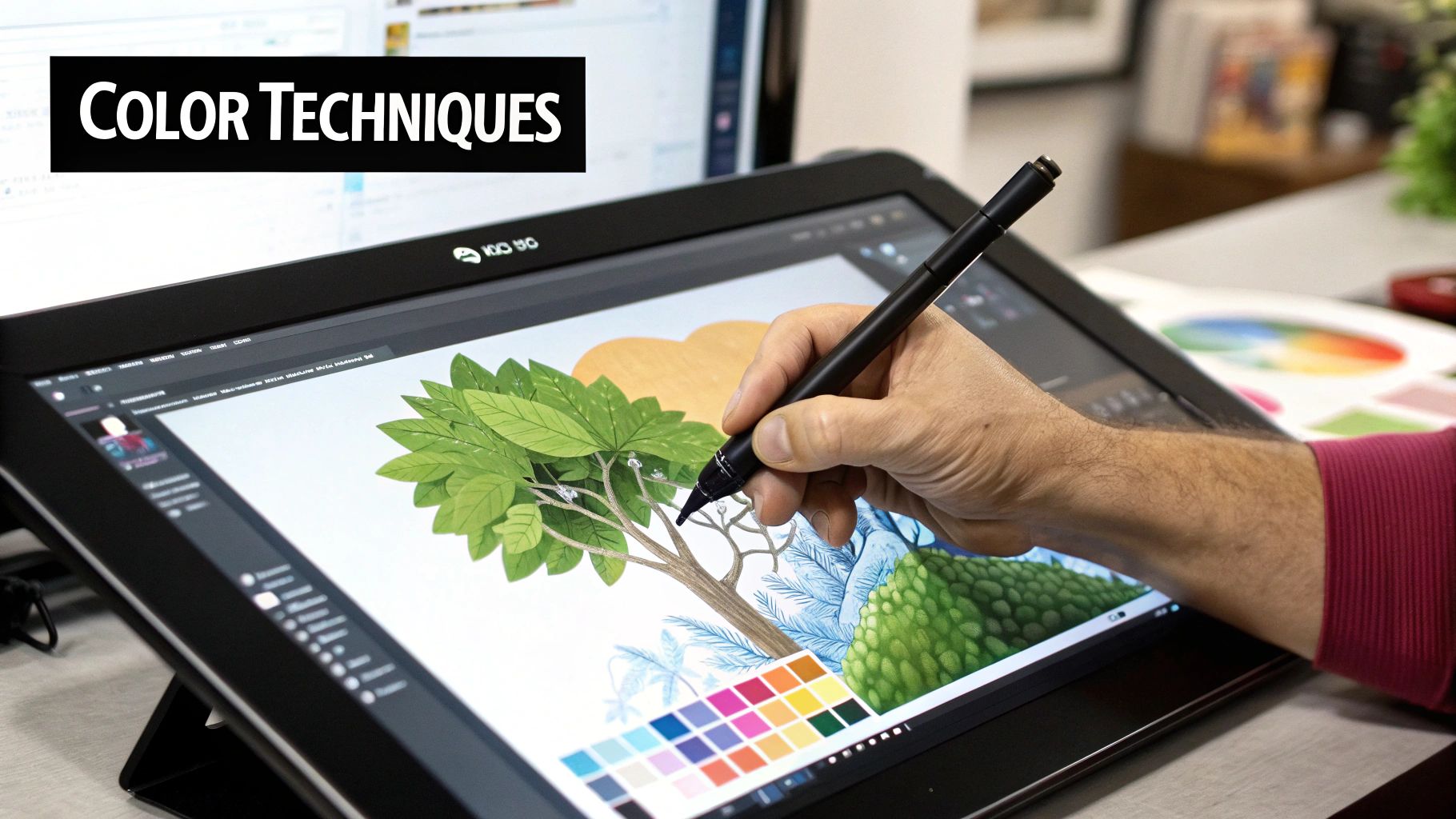
Okay, you've got your plan sorted and your tools are ready to go. Now for the fun part—actually creating the art. This is where your abstract ideas and neatly organized reference folders finally start turning into something real. Moving deliberately through this process, from a rough doodle to a polished final piece, is what separates the good work from the great.
But let's be clear: this isn't about following some rigid, step-by-step formula. Think of it more like a series of proven stages that give your process structure. Each one builds on the last, making sure every mark you make is actively building toward that final vision you have in your head.
Start with Composition Thumbnails
Before you even dream of drawing clean lines, you need to solve the biggest puzzle of your piece: the composition. That's where thumbnails come in. They’re just tiny, fast, and messy sketches—seriously, no bigger than a postage stamp—that let you explore different layouts without any real commitment.
Don't sweat the details here. Perfect anatomy and clean lines have no place in this stage. The only goal is to play with the overall balance, flow, and where you want the viewer's eye to go. I personally aim to create at least 5-10 different thumbnails for a single piece. It’s a great way to force yourself past the first, and usually most boring, idea that pops into your head.
This kind of rapid-fire brainstorming is incredibly freeing. In just a few minutes, you can test out a dramatic low angle, a quiet centered composition, or an energetic diagonal layout. Once you have a handful of options, it's so much easier to see which one tells the story best.
Build Your Clean Line Art
Once you've picked the strongest thumbnail, blow it up on your canvas and start building on it. This is where you move into your rough sketch and line art, refining the shapes and details that were just hinted at before. I always work in layers, starting with a loose "scaffolding" sketch and then gradually building a cleaner, more defined drawing on a new layer right on top.
Here are a few tips that make a world of difference at this stage:
- Use a Different Color: When you're ready to refine your initial sketch, do it in a bright color like blue or red on a new layer. This helps you easily see your new lines against the messy ones underneath.
- Flip Your Canvas: Get in the habit of flipping your canvas horizontally. It's a simple trick, but it instantly gives you a fresh perspective and reveals any lopsided proportions you might have missed.
- Vary Your Line Weight: A single, uniform line thickness is flat and boring. Use thicker lines to bring elements forward and thinner lines to push them back. This adds a surprising amount of depth before you even think about color.
If you take one thing away from this, let it be this: work non-destructively. This means using layers for absolutely everything—sketches, line art, colors, shadows, you name it. If you make a mistake or change your mind, you can just edit that one layer without wrecking the rest of your work.
Block In Your Colors
With your line art looking sharp, it’s time to lay down your base colors. This stage, often called "flatting," isn't about shading or lighting yet. You're simply establishing the foundational color palette and setting the mood. Think of it like a coloring book; you're just filling in the lines with solid, flat colors.
Trust me on this—keep each color on its own separate layer. This gives you incredible flexibility down the road. For instance, putting the character's skin, shirt, and the background on three different layers means you can instantly change the shirt color without touching anything else.
Today’s creative workflows are a lot more collaborative than they used to be. We've moved beyond working in a silo, and now iteration is key, often involving feedback from different teams. Tools like Slack, Figma, and even Google Docs are now standard for sharing progress and getting notes during stages like color blocking. To stay on top of industry trends, you can read more about how collaborative tools are shaping art production.
Render with Light and Shadow
This is where the magic happens. Rendering is the final and often most time-consuming stage where you take those flat colors and bring them to life with light, shadow, and texture. This is what will give your art depth, form, and a sense of realism.
I can't recommend using clipping masks or alpha lock enough for this. These features let you paint only within the boundaries of the layer below. For example, you can create a new layer above your "skin" layer, clip it, and then paint all the shadows and highlights you want without ever worrying about going outside the lines. It's a game-changer.
Similarly, adjustment layers will become your best friend for making flexible edits to color and value. Instead of permanently changing your colors, an adjustment layer (like Curves, Levels, or Hue/Saturation) acts as a filter that you can tweak or delete at any time. This non-destructive approach is a cornerstone of an efficient digital art workflow, giving you total freedom to experiment and refine your piece.
Working Smarter with AI Tools
Artificial intelligence isn't some far-off sci-fi concept anymore; it's a very real, practical assistant that belongs in every modern artist's toolkit. When you learn how to weave AI into your digital art workflow intelligently, you can crush tedious tasks, ignite new ideas, and push your own creative boundaries—all without losing your unique artistic voice.
The trick is to think of AI less as a replacement for your own skill and more like a super-powered intern. For example, I've often found myself with a composition that feels too tight or cramped. Instead of spending hours painstakingly cloning and painting to expand the canvas, I can use a tool like Photoshop’s Generative Fill. It intelligently creates a believable extension of my artwork in seconds.
This isn't just a minor trend; it's a seismic shift in the creative industries. The AI image generation market alone is projected to skyrocket to $1.3 billion by 2025, growing at an incredible annual rate of 35.7%. This boom is happening because new algorithms are making high-quality image creation easier and faster. If you're curious, you can discover more insights about the future of AI in digital art and see how it’s changing professional production.
Using AI as Your Creative Partner
One of the best places to bring in AI is right at the beginning, during the brainstorming and reference-gathering stage. Instead of sinking an hour into searching for that perfect reference photo of a "cyberpunk street market at dusk," a tool like Midjourney or Stable Diffusion can spit out dozens of unique visual takes on that idea in just a few minutes.
Here are a few ways I put AI to work for me:
- Rapid Concepting: I'll generate multiple versions of a character or environment to quickly land on a direction that excites me.
- Mood Board Creation: With just a few text prompts, I can pull together a whole collection of images that nail the exact mood, color palette, and lighting I have in my head.
- Texture Generation: Need a specific sci-fi metal panel or an ancient, cracked stone texture? AI can generate seamless, high-res patterns that I can use immediately.
The point isn't to let the machine do the heavy lifting. It's about using its output as a jumping-off point. You take what it generates and then infuse it with your own skill, personal style, and storytelling.
AI should be a tool that serves your vision, not dictates it. The goal is to offload the repetitive, time-consuming tasks so you can pour more of your energy into the storytelling and artistic choices that truly matter.
Navigating the Ethical Considerations
Of course, with all this power comes some serious ethical questions. It’s absolutely crucial to be aware of how these tools were trained and to use them responsibly. For instance, using AI to perfectly mimic a living artist's style is a huge ethical gray area. On the other hand, using it to expand a background or brainstorm a few lighting schemes is widely seen as a simple workflow enhancement.
Transparency is your best policy here. Be open about your process. As artists, we're the ones who need to lead the conversation on using these tools in a way that respects both creativity and originality. In a way, it’s similar to how other tech fields are adapting; developers, for example, now use AI assistants to write routine code. If that’s something you’re curious about, you can check out our guide on GitHub Copilot.
Ultimately, AI is a powerful addition to your digital art workflow when you use it with clear intention and integrity.
Putting the Finishing Touches on Your Art (and Archiving Like a Pro)
That final brushstroke is an incredible feeling, but your work isn't quite finished. What you do next is what separates a finished piece from a professional, long-lasting asset. It’s all about preparing your art for the world and making sure it's safe for the future.
Exporting for Screen vs. Print
First things first, let's talk about exporting. Where your art is going to live dictates how you save it. One size definitely does not fit all here.
If your piece is headed for a screen—think Instagram, your portfolio on ArtStation, or a client's website—you'll want to use the sRGB color space. This is the standard for most displays, and using it ensures your colors pop and look just as you intended them to across different devices.
But what if you're getting it printed? For posters, zines, or fine art prints, you absolutely must work in and export using a CMYK color profile. Professional printers are calibrated for CMYK, and if you send them an sRGB file, you risk getting back a print with dull, disappointing colors. Trust me, it’s a gut-wrenching experience you want to avoid.
Picking the Perfect File Format
Your file format choice is just as critical as the color profile. Each one has a specific job, and grabbing the wrong one can seriously compromise the quality of your hard work.
- JPG (JPEG): This is your best friend for web use, especially when you need smaller file sizes. It uses compression to keep things light, which is perfect for social media or blog posts, but it does mean a slight loss in quality.
- PNG: Need a transparent background for a logo or a character sprite? PNG is the way to go. It’s also a "lossless" format, so it won’t degrade every time you save it, keeping those crisp lines perfectly sharp.
- TIFF: Consider this your archival master file. TIFFs are high-resolution, lossless, and the gold standard for sending work to a professional printer. The files are massive, but they protect every single pixel of detail.
If you take away only one thing from this guide, let it be this: build a bulletproof archiving system. Your art is your legacy and your business. Don't let a single hard drive failure erase years of effort.
A robust backup strategy isn't complicated. It's a mix of local and cloud storage. I keep my final, layered PSDs and high-res TIFFs on a dedicated external hard drive. Then, I upload another copy to a cloud service like Dropbox or Google Drive.
This is basically the 3-2-1 backup rule—3 copies of your data, on 2 different types of media, with 1 copy stored off-site. It might sound like overkill, but it means your portfolio is always safe, organized, and ready for whatever opportunity comes your way.
Answering Common Questions About Your Digital Art Workflow
Even with the best-laid plans, you're going to hit snags. That's just part of the process. A digital art workflow is a deeply personal system, and getting it right means squashing the little frustrations that kill your creative momentum. Let's tackle some of the most common hurdles I see artists run into when they're building their process.
"My Files Are a Total Mess. How Do I Stay Organized?"
This is probably the biggest one. We've all been there—projects with dozens of confusingly named layers and assets scattered across random folders. The secret weapon here is consistency.
Seriously, it's that simple. You need a go-to folder structure and a strict file naming system you can rely on. Something like ProjectName_AssetType_v01.psd works wonders. It might feel a bit stiff at first, but trust me, this habit will save you from pulling your hair out looking for that one specific file later on. It quickly becomes second nature.
"I Feel Like All This Structure Is Killing My Creativity."
I hear this fear a lot. If your workflow feels like a straitjacket, it's the wrong workflow for you, period. A good process should be a supportive scaffold, not a creative cage. It’s there to handle the tedious stuff so you can focus on the art.
Your workflow should serve your creativity, not stifle it. If you’re feeling blocked, step away from the screen. Go for a walk, sketch in a physical notebook, or switch to a different creative task. The structure will be there when you return with a fresh perspective.
"Can I Use the Same Workflow for Different Art Styles?"
Great question. What if you jump between hyper-detailed illustrations and fast-and-loose concept art? The short answer is yes, you can use the same core framework, but you'll need to adapt it.
Your fundamental pillars—planning, creating, and archiving—don't really change. What changes is where you put your time and energy.
- For Detailed Illustration: You’ll likely invest way more time in the refinement stage—think clean line art, meticulous rendering, and polishing that single, perfect image.
- For Concept Art: It's all about speed and exploration. The workflow here is geared toward producing lots of quick sketches and prioritizing powerful ideas over a flawless finish.
In the end, your workflow isn't a set of rigid rules. It's a living, breathing part of your creative practice that should grow right alongside your skills. For more deep dives and tools to help build systems that truly support your work, check out the resources available on Vibecoding VIP. This kind of flexibility is what makes a digital art workflow genuinely powerful.