Building an interactive website isn't just about bells and whistles; it's about starting a genuine conversation with your audience. Think of it less like a static digital brochure and more like a dynamic experience. By weaving in elements like quizzes, animations, or personalized content, you're inviting visitors to step in and participate, not just passively scroll. This simple shift can turn a forgettable visit into a memorable journey.
Why Interactive Websites Drive Real Engagement
Let's move beyond the idea of just having an online presence. What truly matters is how people feel when they're on your site. A static website is a one-way street—it pushes information out. An interactive site, on the other hand, creates a connection. This is a critical distinction because that feeling, that user experience, has a direct line to your business goals.
When someone can play with a product configurator, adjust settings on a chart, or get instant feedback from a calculator, they form a much stronger, more positive bond with your brand.
This isn't about adding flashy gimmicks for the sake of it. It’s a strategic move to make the user an active part of the story. For instance, a real estate site could offer an interactive mortgage calculator, giving immediate, tangible value. An e-commerce store could let you spin a product around with a 3D viewer. These aren't just features; they're tools that encourage people to stick around and dig deeper.
The Tangible Benefits of Interactivity
Adopting an interactive design philosophy pays off in ways you can actually measure. It’s not just window dressing—it’s a functional approach that directly fuels your site's success. The whole idea is to smooth out the user's path and inject a bit of delight, guiding them naturally toward whatever you want them to do next.
Here’s where you’ll see the real impact:
- Dramatically Lower Bounce Rates: Give people something to do, and they're far less likely to hit the back button after landing on a single page. Interactive elements are a compelling reason to click, scroll, and explore.
- Increased Time on Page: Things like quizzes, polls, or dynamic data visualizations keep visitors engaged, which significantly boosts how long they stay. To search engines, this is a huge signal that your content is high-quality.
- Improved Brand Loyalty: A fun, memorable experience sticks with people. They're much more likely to remember and come back to a site that gave them something unique and engaging to do.
It really boils down to this: a static site tells, while an interactive site shows and involves. Making that switch from monologue to dialogue is what builds real customer relationships in a very crowded online world.
Let's look at the advantages in a more structured way. Building an interactive website isn't just about aesthetics; it has a clear and positive impact on your business metrics.
Core Benefits of an Interactive Website
| Benefit | Impact on Business |
|---|---|
| Higher Engagement | Keeps users on your site longer, reducing bounce rates and signaling content value to search engines. |
| Better Lead Generation | Interactive tools like quizzes or calculators capture user information in a natural, value-driven way. |
| Increased Conversions | A guided, personalized experience can lead users more effectively toward a purchase or sign-up. |
| Enhanced Brand Recall | Memorable and unique experiences make your brand stand out from the competition. |
| Richer User Data | Interactions provide valuable insights into user preferences and behavior, informing future strategy. |
This isn't just theory; the data backs it up. We've seen that websites with features like quizzes and animations can see around 70% more user interaction compared to static ones. That surge in engagement is a powerful catalyst for conversions. In fact, some studies show that personalized web experiences can lift conversion rates by a staggering 202%. You can dig into more data on web design effectiveness to see the full picture.
Ultimately, choosing to create an interactive website is an investment in your audience. It's a clear signal that you respect their time and are dedicated to giving them a far better experience than the competition, who might still be stuck talking at their customers instead of with them.
Choosing Your Interactive Development Toolkit
Before you can even think about writing the code that will bring your interactive ideas to life, you've got to pick your tools. It’s a lot like a chef prepping their station—having the right knives and pans makes all the difference. The absolute bedrock for any interactive website is, and always will be, the classic trio: HTML, CSS, and JavaScript. These are your non-negotiables. They handle the structure, the looks, and the core logic of everything a user sees and does.
But let's be realistic. Very few of us are building complex interactive experiences from scratch these days. That’s where frameworks and libraries come into play. They give you a massive head start by providing battle-tested, pre-written code for all the heavy lifting. This frees you up to focus on what really matters: crafting a unique and engaging experience for your users instead of reinventing the wheel. The framework you choose will have a huge impact on your workflow, your site's performance, and what you can ultimately build.
Comparing Popular JavaScript Frameworks for Interactivity
When you wade into the JavaScript ecosystem, you'll find a ton of options, but for building modern, interactive user interfaces (UIs), three names constantly pop up: React, Vue, and Svelte. Each has its own philosophy and shines in different scenarios.
This table gives a quick rundown to help you get your bearings.
Comparing Popular JavaScript Frameworks for Interactivity
| Framework | Best For | Key Feature |
|---|---|---|
| React | Large, complex single-page applications (SPAs) | Component-based architecture; allows for building UIs with reusable "pieces." |
| Vue | Projects needing a gentle learning curve; flexible integration | Progressive adoption; can be used for a small part of a page or a full-scale app. |
| Svelte | Performance-critical projects; static sites | A compiler, not a library; shifts work from the browser to the build step. |
Let's unpack that a little.
- React is my go-to for big, data-heavy applications. Its component-based approach is brilliant for taming complexity. You build small, self-contained UI pieces (like a search bar or a button) and then compose them into larger features. It's like building with high-tech LEGOs.
- Vue is incredibly approachable. Its documentation is fantastic, and the learning curve feels much less steep than React's. This makes it an amazing choice if you're just dipping your toes into interactive development or for projects where you need to get moving quickly.
- Svelte is the clever one in the group. It's actually a compiler. Instead of shipping a library to the user's browser to manage your UI, Svelte converts your code into highly optimized, plain JavaScript during your build process. The result? Often smaller bundles and blazing-fast performance, which is a massive win, especially on mobile.
If you want to see what other tools pair nicely with these frameworks, we've put together a list of our favorite essential vibe coding tools and resources.
The key takeaway here is there's no single "best" framework. The right choice depends entirely on your project's scale, your team's skillset, and your performance targets. Don't just pick the most popular one; pick the one that fits your specific needs.
Here's a look at React's homepage, which perfectly captures its core idea.
That line about building UIs from "pieces called components" is everything. It's the principle that makes managing huge, complex interfaces feel possible.
Setting Up Your Development Environment
Once you've settled on a framework, it's time to get your local development environment running. Thankfully, this process is way easier than it used to be, largely thanks to tools like Vite. Vite is a modern build tool that offers a development server that starts up almost instantly and intelligently bundles your code for when you're ready to go live.
The push for tools that speed up development makes perfect sense. The market for AI-powered design tools is projected to reach $6.77 billion in 2025, growing at an incredible 22.2% annually. Efficiency is the name of the game. And with over 60% of all web traffic coming from mobile devices, building fast, optimized interactive sites isn't just a good idea—it's a requirement. If you're interested in the data behind these trends, you can find more web design statistics that paint a clear picture.
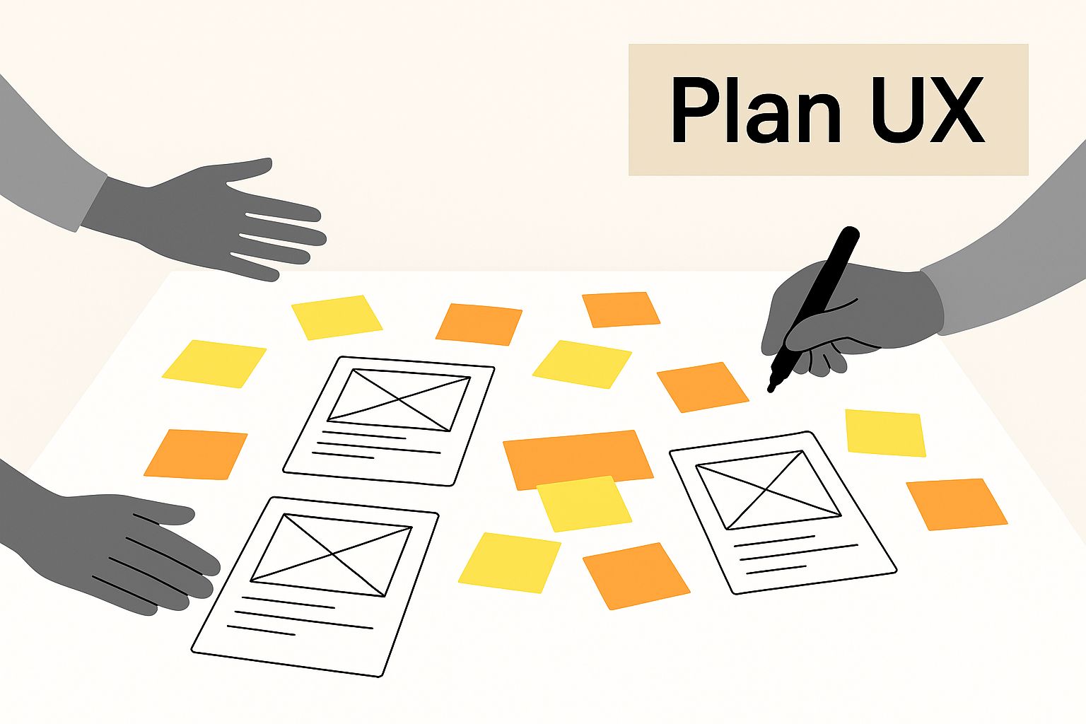
This image really drives home the importance of the planning phase, where your tool choices and user experience goals have to align.
It’s a great reminder that before a single line of code gets written, having a solid plan for how users will interact with your site is the most critical piece of the puzzle.
Building Your First Interactive Elements
Alright, enough with the theory. It's time to roll up our sleeves and get our hands dirty with some code. This is where we start building the features that breathe life into your website. We're going to skip the typical "hello world" and jump straight into creating elements that actually engage your visitors and add real value. The goal here isn't just to follow a recipe; it's to understand the thinking behind the code so you can spin up your own unique interactions down the road.
We’ll kick things off with something that’s almost universally engaging: a simple quiz. Quizzes are fantastic for capturing leads and keeping people on your site longer because they play on our natural curiosity.
Crafting an Interactive Quiz
You don't need a massive, complicated framework to build a compelling quiz. You can pull off something great with just a bit of HTML, CSS, and some plain JavaScript. The real trick is to give immediate feedback, which makes the whole experience feel responsive and genuinely satisfying for the user.
Let's say you're building a straightforward multiple-choice quiz. Here’s how I’d approach it:
- HTML Structure: First, lay out the bones of the quiz. I'd give each question its own
divthat holds the question text and a list of possible answers. It's best to make each answer a<button>so we can easily hook into it with JavaScript. - CSS Styling: Next, make it look good. This is your chance to define how the buttons appear before, during, and after a click. I always add a
hovereffect and create distinct styles for correct and incorrect answers—maybe turning the button green for correct and red for incorrect. - JavaScript Logic: This is where the magic happens. You’ll write a script that listens for clicks on those answer buttons. When a user makes a choice, the script checks if it's the right one, applies the corresponding CSS class (like
.corrector.incorrect), and updates a score.
The most critical piece of the puzzle is that instant visual feedback. When someone clicks an answer and the button immediately changes color, it confirms their action and encourages them to see the quiz through to the end. It's a small detail that makes a world of difference in the user experience.
If you’re hunting for more ideas, we have a bunch of interactive examples with full code breakdowns over on our Vibecoding examples page.
Visualizing Data with D3.js
When you're faced with presenting complex data, static charts and boring tables just won't cut it. A much better way to create an interactive website is to transform that data into something your users can actually explore and play with. This is precisely where a library like D3.js (Data-Driven Documents) comes in.
D3 lets you connect your data to the webpage's structure (the DOM) and then apply dynamic changes based on that data. Put simply, it’s a tool for creating absolutely stunning, interactive data visualizations that go far beyond a static image.
Imagine you need to show population growth over several decades. Instead of just a boring line graph, you could use D3 to build a chart where users can hover over any year to see the exact numbers. You could even add a button that animates the graph's progression from the start date to the end date.
Here’s just a taste of what’s possible with D3.

This screenshot from the official D3 site shows the incredible range you can achieve, from relatively simple bar charts to deeply intricate network diagrams and geographical maps.
Implementing Smooth Parallax Scrolling
Another fantastic technique for adding a sense of depth and a premium feel to your site is parallax scrolling. This effect happens when background elements move slower than foreground elements as the user scrolls, creating a compelling illusion of 3D depth.
It might look complicated, but the core idea is surprisingly simple and can be done with some clever CSS and a sprinkle of JavaScript.
- Setting the Stage with CSS: The foundation of the effect is a background image container with its
background-attachmentproperty set tofixed. This is what locks the background image in place relative to the viewport, creating the initial illusion. - Refining with JavaScript: For more granular control, you can use JavaScript to listen for the
scrollevent. As the user scrolls, your script can dynamically change thebackground-positionof the parallax element. This gives you precise command over the speed and feel of the effect.
This combination creates a subtle yet powerful sense of immersion. It can make a standard webpage feel far more engaging and professionally designed, guiding the user's eye down the page in a smooth, story-like fashion.
Optimizing Your Site for Flawless Performance
Let's be honest: an interactive website is only as good as its performance. You can build the most brilliant animations and engaging tools, but if your site feels sluggish or unresponsive, none of it matters. A slow interactive feature is often more frustrating for a user than a simple, static page that just works. This is why optimization isn't just a nice-to-have; it's a core part of the job.
We're all impatient online. Research shows that while people might spend an average of 6.5 hours online a day, they only give about 54 seconds to each new page. That's your entire window to impress them.
The stakes are incredibly high. Consider that 53% of mobile users will ditch a site if it takes longer than three seconds to load. And if they have a bad experience? A whopping 88% of online shoppers say they are less likely to come back. You can learn more about the impact of website performance on user behavior.
Smart Loading for a Faster First Impression
So, how do we make things faster? One of the most powerful techniques in our arsenal is lazy loading. It’s a simple concept: you tell the browser to only load images and other heavy assets right as they’re about to scroll into view. Instead of forcing a user to download everything at once, you prioritize what they see first. The impact on initial load times can be massive.
You can apply the same logic to your interactive code. Let's say you have a complex data visualization or a detailed quiz halfway down the page. There’s absolutely no reason to load all that JavaScript the moment the page opens. By deferring the load until a user actually scrolls to that section, you free up the browser to render the initial content much, much faster.
Taming Performance-Intensive Interactions
Some of the coolest interactive features—the ones tied to scroll position or mouse movement—can be real performance hogs if you're not careful. A classic rookie mistake is attaching a function directly to a scroll event listener. This event can fire hundreds of times a second as the user scrolls, leading to that janky, stuttering feel we all hate.
This is where a technique called debouncing comes to the rescue. Debouncing is a lifesaver. It ensures your code only runs once after a specific period of inactivity. For instance, instead of recalculating an element’s position for every single pixel of a scroll, a debounced function would wait until the user has stopped scrolling for, say, 200 milliseconds, and then run the calculation. It’s a game-changer for smoothness.
Key Takeaway: Performance isn't something you bolt on at the end; it's a foundational feature. Optimizing how and when your code executes is just as critical as the visual design of the interaction itself.
Get comfortable with your browser's developer tools. The "Performance" and "Lighthouse" tabs in Chrome DevTools are indispensable for hunting down bottlenecks. They'll show you exactly which scripts are causing delays and which assets are slowing you down, giving you a clear roadmap for what to fix. For a deeper dive into optimization, check out our collection of performance-enhancing resources.
Testing and Launching Your Interactive Website
You’re in the home stretch. You’ve designed, coded, and built something amazing, but this last phase is what separates a good project from a great one. Getting your interactive site tested and launched properly is where all your hard work pays off, ensuring your audience sees it exactly as you imagined. I've seen too many developers rush this part and regret it later.
Think about this: there are already 1.13 billion websites out there, with 83.64% of visitors showing up on mobile devices. A tiny bug on one browser or a janky animation on a phone can make you just another statistic. If you want to dig into more web stats, you'll see why this is so critical.
Ensuring Cross-Browser and Device Compatibility
What looks perfect on your computer might be a complete mess on someone else's. That's why you need to test your site everywhere. Seriously. Everywhere.
- Browser Gauntlet: At a minimum, you have to test on the latest versions of Google Chrome, Mozilla Firefox, and Apple Safari. Tools like BrowserStack or LambdaTest are lifesavers here; they let you see how your site renders across dozens of browser-OS combinations without needing a room full of computers.
- Device Deep-Dive: Your interactive elements need to feel right on every screen. Pull it up on your phone. Borrow a friend's tablet. Resize your desktop browser window from huge to tiny. Make sure every button is tappable and every animation is smooth, especially on touchscreens.
It's not just about making sure things don't break. The real goal is to deliver an experience that feels intentional and premium, whether it’s on a massive 27-inch monitor or a small phone screen.
The Final Polish and Deployment
With your testing done and bugs squashed, it's time to get your site out into the world. A simple pre-flight checklist will help you go from your local setup to a live, professional website smoothly.
First, you'll want to minify your code. This means running a build process that strips out all the extra spaces and comments from your HTML, CSS, and JavaScript files. The result is smaller files that load much faster for your visitors.
Next, run an accessibility check. The Lighthouse tool built right into Chrome DevTools is perfect for this. It’ll give you a report on how accessible your site is and point out issues you need to fix so that people using screen readers can navigate your content.
Finally, it's time for hosting and deployment. For modern JavaScript sites, platforms like Netlify or Vercel are my go-to recommendations. They simplify the entire process by connecting directly to your code repository on GitHub or GitLab.
Take Netlify, for instance. You can literally just drag and drop your project folder to deploy it.

It’s pretty clear these platforms are built to make a developer's life easier. They handle the complex stuff behind the scenes, so you get a fast, automated deployment—a huge relief after a long build.
Answering Your Top Questions About Interactive Web Design
As you start exploring interactive design, you'll probably run into the same questions I did when I first started. Getting these sorted out early on is a game-changer—it helps you nail down your project's scope, budget, and the tech you'll need, making the whole process a lot less bumpy.
How Much Does an Interactive Website Cost?
This is the big one, and the honest answer is: it depends. The price range for an interactive site is massive.
If you're just dipping your toes in, you could hire a freelancer to trick out a template with a few interactive plugins. That might run you anywhere from a few hundred to a couple of thousand dollars. It’s a solid way to get started without needing a huge budget.
But if you're dreaming of a completely custom experience—think intricate animations, personalized user paths, and heavy database work—you're playing in a different league. For that kind of project, you could be looking at a budget anywhere from $10,000 to well over $50,000. The final number really comes down to the agency you work with and just how ambitious your vision is.
Going the DIY route? Your main costs will be your time, hosting (usually $10-$30/month), and any premium tools you decide you can't live without.
Can I Make My Existing WordPress Site Interactive?
Of course! That's one of the best things about WordPress. It’s a fantastic foundation for building interactive experiences, so there's no need to tear everything down and start over.
You can inject a ton of engagement with plugins for quizzes, polls, dynamic galleries, and more. They're easy to install and can make a big impact fast.
When you're ready for something more custom, page builders that support custom JavaScript are your best friend. This is where you can start weaving in powerful libraries like GreenSock (GSAP) for slick animations or Chart.js for data visualizations, all without leaving your WordPress dashboard.
My Two Cents: Be picky about your plugins. Always go for ones that are well-supported and built for speed. Piling on a bunch of clunky, poorly coded plugins will drag your site's performance down, which completely undermines the goal of creating a great user experience.
What’s the Difference Between Interactive and Dynamic?
People throw these terms around a lot, sometimes using them to mean the same thing. But they're not interchangeable, and knowing the difference will help you talk more clearly with your team.
- A dynamic website is all about content that's generated on the server, usually from a database. Think of your favorite news site—the articles are pulled from a CMS. Or an online store where product info is loaded for each item. The content changes, but the user isn't directly controlling the interface itself.
- An interactive website focuses on the user's experience on the front end—what happens on their screen. We're talking about clicking, dragging, cool scroll effects, or filling out a form that gives immediate feedback. The user's actions cause a direct, real-time reaction on the page.
And yes, a website can absolutely be both. The perfect example is an e-commerce product page. The product details are pulled from a database (dynamic), but the page might also feature a 3D product viewer you can spin around with your mouse (interactive).