Ever found yourself staring at code, trying to mentally trace how a binary search tree rebalances itself or how Dijkstra's algorithm sniffs out the shortest path? If so, you're in good company. It's tough to grasp concepts you can't see.
Data structure visualization is the art of taking that abstract code—all the pointers, nodes, and operations—and turning it into an interactive, visual model. This simple shift can transform a head-scratching problem into something you can finally see, poke, and understand.
How to See Your Code in Action
Let's use an analogy. Imagine you're trying to understand how a car engine works. Would you rather sift through a dense, 200-page technical manual, or play with an animated 3D model that you can spin around, take apart, and see in motion? Most of us would jump at the 3D model, and for good reason.
Data structure visualization applies that same powerful principle to programming. It's not about making things look flashy; it's about building a solid, intuitive grasp of how data is stored and manipulated. When you can literally watch the nodes of a linked list connect and disconnect, or see a quicksort algorithm shuffle elements into place, abstract rules suddenly become concrete, observable processes.
From Abstract to Actionable
The real magic here is how visualization bridges the gap between theory and reality. It’s one thing to memorize the rules of how a hash table resolves collisions, but it’s a completely different experience to watch it happen, step-by-step. That visual feedback makes the logic feel natural.
By translating code into motion and shape, we give our brains a second way to process information. This dual-coding approach dramatically improves retention and comprehension, especially for intricate topics like graph traversals or tree balancing.
This practice helps you build a strong mental model of what’s happening "under the hood." You can be told that an array has a fixed size, but seeing the program crash—or the painful process of creating a new, larger array and copying everything over—when you try to add one too many elements is a lesson that sticks.
Common Data Structures and Visual Analogies
To get started, it helps to connect data structures to things we already understand from the real world. This creates a mental shortcut that makes their behavior much easier to predict.
Here’s a table that connects common data structures to simple analogies to help you start visualizing their behavior.
| Data Structure | Common Visual Analogy | Key Characteristic |
|---|---|---|
| Array | A row of numbered mailboxes | Elements are accessed by their index (mailbox number). |
| Linked List | A treasure hunt with clues | Each element points directly to the next one in the sequence. |
| Stack | A stack of plates | You can only add or remove items from the top (Last-In, First-Out). |
| Queue | A line at a checkout counter | Items are processed in the order they arrived (First-In, First-Out). |
| Binary Tree | A family tree | Each node has at most two children, creating a branching structure. |
These simple comparisons are a great starting point.
Ultimately, using data structure visualization turns "invisible" code logic into a tangible experience. It's a powerful technique that can seriously accelerate your journey from feeling like a beginner to thinking like an expert.
The Historical Roots of Visualizing Data
It’s easy to think of data structure visualization as a modern invention, a direct product of our digital world. But the truth is, we're building on concepts that are centuries old. The practice stands on the shoulders of giants—pioneers in statistical graphics and map-making who first wrestled with the challenge of making complex information understandable at a glance.
This journey really started to pick up steam back in the 17th century with the rise of statistical graphics. Early innovators, like Michael Florent Van Langren with his 1644 visual analysis, began proving that you could tell a powerful story by turning numbers into shapes. Later, legends like William Playfair pushed things forward by using bar charts and line graphs for economic data. And who could forget Charles Joseph Minard’s incredible 1869 diagram of Napoleon’s disastrous Russian campaign? It’s a masterclass in multi-dimensional storytelling. If you’re curious, you can explore a deeper history of these developments and see just how they set the stage for the tools we use today.
That rich tradition of transforming raw numbers into visual insight is the very foundation for how we now map out abstract data structures like trees and graphs.
The Evolution of Core Structures
As visualization techniques were getting better, the data structures themselves were also evolving. In the early days of programming, we were stuck with simple, rigid structures. But as the problems we tried to solve got more complex, we desperately needed more dynamic and powerful ways to model our data.
It's so important to grasp this progression. The leap from fixed arrays to dynamic, high-level structures isn't just a boring technical detail. It’s a story about our ongoing battle against complexity—a battle that directly fueled the need for better visualization.
This timeline gives you a snapshot of how some of these core structures came into their own during the back half of the 20th century.
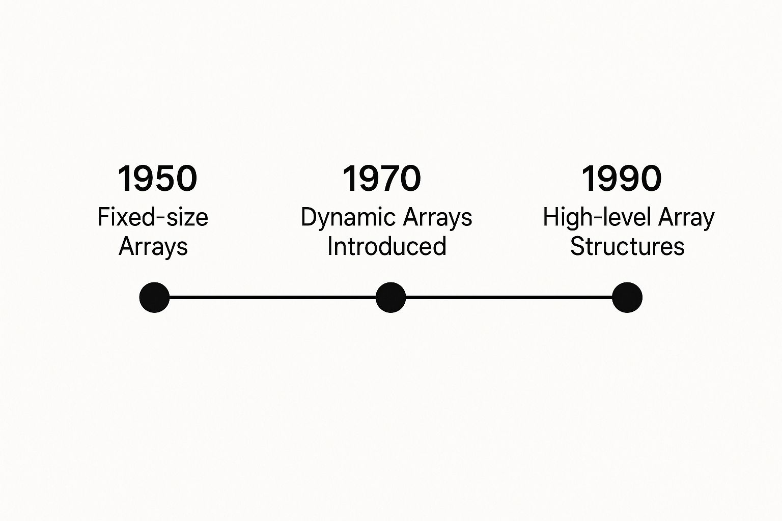
As the infographic shows, the trend was clear: we moved from static blocks of memory toward far more abstract and flexible models that could adapt on the fly. This shift gave developers incredible power, but it also ramped up the mental effort required to keep track of everything. Suddenly, effective data structure visualization wasn't just a "nice-to-have"; it was becoming essential.
Connecting Past and Present
So, when you see an interactive graph or an animated binary tree today, you're looking at the latest chapter in a very long story. The fundamental challenge has never really changed: how do we draw abstract relationships in a way that our brains can intuitively understand?
The pioneers of statistical graphics gave us the visual grammar we still use. Think about it:
- Positional encoding: Using an X/Y axis to represent values.
- Color and shape: Giving different visual properties specific meanings.
- Spatial arrangement: Placing related items close together to show a connection.
These core principles, figured out hundreds of years ago, are the same ones that power modern data structure viewers. When you fire up a tool to watch a sorting algorithm in action, you're seeing the direct descendant of the same creative spark that led Minard to map an army's tragic march across a continent. It's all connected.
Core Principles for Effective Visualization

When you’re trying to visualize a data structure, you're doing more than just slapping some shapes and lines on a screen. The best visualizations are built on a solid foundation of principles that work with our brains, not against them. It’s all about tapping into how we instinctively spot patterns and understand relationships to make something complex feel intuitive.
Think of it like this: a bad visualization is a map without a legend and a bunch of random symbols. A good one, however, speaks a language your brain already gets. This is where clarity, consistency, and interactivity become your guiding stars, forming the bedrock of any visualizer that’s actually helpful.
A great visualization isn’t a static picture. It’s a story in motion. Every single element—from a node’s color to the way a new connection animates into existence—needs to have a clear purpose.
Achieving Clarity and Consistency
The absolute first rule of the game is clarity. If someone has to pause and squint to figure out what they’re looking at, you’ve already lost. This means every visual component needs a single, unmistakable meaning that stays the same from start to finish.
Consistency is how you nail that clarity. For instance, if you decide a node in your binary tree is a blue circle, then every node should be a blue circle. If a new element flashes green when it’s added, that has to happen every single time. This kind of predictability frees up mental energy, letting the user focus on the why of the algorithm instead of the what of the visuals.
Your goal is to create a visual system so consistent that the user forgets they are looking at a simulation and instead feels like they are directly observing the data structure itself. This seamless experience is where true understanding is built.
The Role of Perception and Interactivity
It’s funny to think that visualization had a rocky start. Back in the early 20th century, some statisticians were skeptical, preferring raw tables of numbers because they believed charts could be misleading. Yet, at the same time, charts and graphs started popping up everywhere in business reports. It was this tension, combined with breakthroughs in cognitive psychology, that gave us a deeper understanding of how we perceive information. This is what turned visualization from a simple reporting tool into a powerful method for analysis.
This history lesson brings us to a critical point: interactivity. An effective visualization isn't a movie you just watch; it's a sandbox you get to play in. A good tool should let you:
- Control the Pace: Step through an algorithm one move at a time. Pause. Rewind. See what happens at those crucial moments.
- Manipulate the View: Zoom in on a busy part of a graph or rotate a 3D structure to get a different perspective.
- Query Elements: Hover over a node to see its current value or click an edge to get details about that specific relationship.
This ability to get your hands dirty is what transforms learning from a passive chore into an active discovery. It’s how these abstract concepts really start to stick. For more guides and tools to help you on your journey, check out our collection of valuable vibe coding resources.
How to Choose the Right Visualization Tool
With so many visualization tools out there, picking the right one can feel like a chore. The secret is to think about what you’re trying to accomplish. Are you cramming for an algorithms exam? Maybe you're deep in the trenches, debugging a gnarly piece of production code. Or perhaps you need to whip up some slick visuals for a presentation. Each of these jobs calls for a different kind of tool.
Your options really fall into three main camps. You've got interactive learning platforms, which are fantastic for students and anyone learning the ropes. Then there are the programmatic libraries, giving developers the keys to the kingdom for building custom visuals. And finally, you have IDE-integrated debuggers that show you what’s happening live, right inside your editor.
Interactive Learning Platforms
If you're just starting out or need to brush up on the fundamentals, interactive learning platforms are your best friend. These are typically web-based tools built specifically for education. They give you a sandbox to play in—you can pick a data structure, feed it your own data, and watch step-by-step as an algorithm does its thing.
A great example is VisuAlgo. It's incredibly popular because it focuses purely on the concepts, not the implementation details, so you don't get bogged down in code.

What you're seeing here is VisuAlgo showing a binary search tree in action. It lets you watch operations like insertions and deletions happen in real-time. This kind of hands-on experience is gold for building a solid mental picture of how these abstract structures actually behave.
Programmatic and Integrated Tools
Once you move past the classroom and into actual development, your needs get a bit more serious. This is where programmatic libraries and integrated debuggers come into play.
-
Programmatic Libraries: When you need total creative control, you turn to libraries like D3.js for JavaScript or Matplotlib for Python. These give you the power to code completely custom visualizations from scratch, perfect for research papers, blog posts, or tech talks.
-
IDE-Integrated Debuggers: Modern IDEs like VS Code and IntelliJ IDEA have amazing debugging tools that can visually map out your data structures at any breakpoint. This isn't about learning concepts; it's about practical, in-the-moment problem-solving when you're hunting down a bug.
The best tool is simply the one that removes the most friction between you and understanding. For a student, that’s probably an interactive website. For a working developer, it's often the debugger that’s just a click away.
To help you get a clearer picture of the landscape, I've put together a quick comparison of some popular tools.
Comparison of Data Structure Visualization Tools
| Tool Name | Primary Use Case | Key Features | Ideal For |
|---|---|---|---|
| VisuAlgo | Education and learning core CS concepts. | Interactive, step-by-step animations for dozens of algorithms and data structures. No coding required. | Students and self-learners. |
| D3.js | Creating custom, data-driven visualizations for the web. | Immense flexibility, SVG/HTML/CSS manipulation, powerful data binding. | Developers needing bespoke visuals for web projects. |
| Python Tutor | Visualizing code execution step-by-step. | Shows memory layout and variable states as the code runs. Supports multiple languages. | Beginners debugging simple scripts and learning execution flow. |
| IDE Debugger (e.g., VS Code) | Real-time debugging and state inspection. | Integrated into the coding workflow, breakpoints, live variable inspection. | Professional developers solving complex bugs. |
Ultimately, choosing the right option is all about matching its strengths to your immediate goal.
If you're looking for a great place to start, we've put together a list of our favorites. You can check out our directory of the best vibe coding tools to find one that works for you.
Real-World Applications in Learning and Development

Beyond the theoretical, the most profound impact of data structure visualization is in how we learn and grow as developers. It's become an indispensable teaching aid in computer science, completely changing how students connect with abstract—and often intimidating—topics. Let's be honest, watching an algorithm run makes the logic click in a way that staring at pseudocode on a page never could.
This visual approach shifts learning from a passive chore into an active, hands-on exploration. Instead of trying to mentally trace pointers and juggle array indices, students can directly interact with a living, breathing model of the data. This kind of experience builds a much stronger, more intuitive foundation for tackling the real-world programming challenges ahead.
Mastering Complexity Through Interaction
Interactive platforms are total game-changers for anyone learning to code. They create a sandbox where you can experiment, make mistakes, and instantly see the consequences of your code without the headache of setting up a complicated local environment. This is where the right tools really prove their worth.
In computational education, for example, visualization is now a core component for making learning stick. Tools like CStutor let students play with data representations like trees and graphs, turning abstract ideas into something tangible. Studies have found that students who use these visual tools are far more likely to master tricky algorithmic logic, which directly translates to better problem-solving skills and higher grades. For a deep dive, you can explore detailed insights on how visualization aids competitive programming.
The ability to visualize an algorithm's execution step-by-step is transformative. It turns debugging from a frustrating hunt for errors into a valuable learning opportunity, revealing exactly where the logic went astray.
From the Classroom to Professional Development
This educational power isn't just for university students. Professional developers rely on these same principles every day to upskill and get their heads around new technologies. When a team needs to understand a complex system architecture or a new algorithm, a shared visualization is often the fastest way to get everyone on the same page.
Here’s how it helps at every stage of a developer's career:
- Onboarding New Engineers: Visualizations can bring new team members up to speed on a project's core data models in a fraction of the time.
- Algorithm Design: Sketching out a data flow visually helps teams spot potential bottlenecks or inefficiencies before a single line of code is ever written.
- Lifelong Learning: As new, more complex data structures pop up, visualization tools give us a direct path to understanding and implementing them effectively.
Ultimately, these tools close the gap between knowing a concept and truly understanding it. If you want to see this in action, check out some of the inspiring vibe coding examples that bring these ideas to life.
Building Your First Visualization Project
Theory is great, but let's be honest—the real learning happens when you get your hands dirty. This is where we'll walk through building a simple data structure visualization from the ground up. We're going to skip the complicated frameworks and focus purely on the core logic. The goal is to get a quick, tangible win and give you a solid foundation you can actually build on.
We'll start with a classic: a basic visualizer for a linked list. It's one of the most fundamental data structures, making it the perfect starting point. The aim here isn't to build a production-ready application. It's to pull back the curtain and show you how to turn abstract concepts like nodes and pointers into concrete shapes and lines on a screen.
By the end of this, you'll see exactly how it's done.
Setting Up Your Workspace
First things first, you don't need some complex, multi-layered development environment. A simple HTML file, a dash of CSS for styling, and a bit of JavaScript to handle the logic is all it takes. We'll use a library called D3.js because it was practically born for this kind of data-driven work.
Here’s the simple setup:
- Create an HTML File: Start with a barebones
index.html. The only thing you need in the<body>is an<svg>element. Think of this as the canvas where your visualization will come to life. - Include the Library: You don't even need to download anything. Just grab the D3.js CDN link and pop it into a
<script>tag in your HTML file’s<head>. - Basic CSS: Make a
style.cssfile to define what your nodes and links look like. For now, a few simple rules for circles (our nodes) and lines (our connections) are all you need.
This minimal approach keeps the focus right where it should be—on the visualization logic itself, not on fighting with tools.
Representing Nodes and Edges
Okay, our stage is set. Now, how do we translate our data into something visual? In a linked list, you have two main components: the nodes that hold the data and the pointers that connect them.
The secret to data structure visualization is creating a direct, one-to-one mapping between your data and what appears on the screen. A node becomes a circle, its value becomes text inside that circle, and a pointer becomes a line connecting it to the next one.
Let’s start by defining our linked list in JavaScript. An array of objects is perfect for this. Each object will represent a node, containing its value and where it should appear on our canvas. Something like this: [{value: 'A', x: 50, y: 150}, {value: 'B', x: 150, y: 150}].
With our data ready, we can use D3.js to bind it to our SVG canvas.
- Nodes: We'll use D3’s famous
.selectAll('circle').data(nodes).enter().append('circle')pattern. This might look a little strange at first, but it’s a powerful way to tell D3, "for every item in my data array, create a new circle." Then, you just set its radius (r) and position (cx,cy). - Edges: To represent the pointers, we'll draw lines. All a line needs is a starting point (
x1,y1) and an ending point (x2,y2), which we can get from the positions of the nodes it connects. - Labels: Finally, we’ll add text elements. We'll position them right in the center of each circle to display the node's value, making the visualization easy to read.
Adding a Spark of Interactivity
A static diagram is useful, but an interactive one is where the real magic begins. Let's add a simple hover effect to bring it to life. With just a few lines of code, you can use D3's event listeners to make a node change color or grow slightly when a user mouses over it.
This small touch of interactivity is a gateway to more advanced features. From here, you could easily add buttons to insert or delete nodes, animating the changes to give the user clear visual feedback.
By building this one simple project, you've already made the leap from being a passive consumer of visualizations to an active creator. You've proven that the "magic" behind data structure visualization isn't magic at all—it's accessible, logical, and with a little practice, completely within your grasp.
A Few Common Questions Answered
Dipping your toes into the world of data structure visualization usually sparks a few questions. Let's tackle some of the most common ones I hear, so you can move forward with confidence.
What's the Real Payoff of Doing All This?
The biggest win is turning abstract data concepts into something you can actually see and interact with. It’s one thing to read about how a binary search tree balances itself, but it's another thing entirely to watch it happen. This visual feedback makes complex ideas much easier to grasp and remember than just staring at code.
Think of it like this: watching a video of an engine working is far more intuitive than just reading the manual. You build a much deeper, more instinctive understanding of how the pieces fit together.
By making the invisible visible, you're not just learning a concept; you're building a strong mental model of how it works. This is crucial for both effective debugging and innovative problem-solving.
Can I Use These Visualizers with Any Programming Language?
It really depends on the tool you pick up. Some visualizers are built to be completely language-agnostic, meaning they focus purely on the structure's logic and behavior, not the code that implements it. These are great for pure conceptual learning.
On the other hand, many powerful tools are tied to a specific ecosystem. Programmatic libraries like D3.js are rooted in JavaScript, and the visual debuggers built into IDEs are, by nature, specific to the language you're working with. The key is to match the tool to your stack and your goal.
Is This Stuff Just for Students?
Not at all. While visualization is a fantastic aid for anyone learning the ropes, it’s a tool that seasoned developers rely on constantly. When you're trying to hunt down a bizarre bug in a massive, tangled data structure, seeing it laid out visually can be the difference between a quick fix and a week of headaches.
Beyond debugging, professionals use visualization to design better algorithms from the ground up or to explain a system's complex data flow to the rest of the team. It gets everyone on the same page, fast.