What Makes Interactive Web Design Actually Work
Think of interactive web design as the difference between observing a static photograph and becoming a character in a movie. A photo captures a single, unmoving moment, but a movie draws you into its world with movement, sound, and a story. In the same way, interactive design isn't just about adding flashy animations; it's about starting a meaningful, two-way conversation between your website and its visitors. This dialogue turns passive browsing into active involvement, making people feel seen and understood.
When a user’s cursor hovers over a button and it subtly changes color, or when they click a menu that smoothly unfolds, they are part of this conversation. These small but significant micro-interactions are the foundation of a great user experience. They offer immediate feedback, confirming an action was successful and hinting at what comes next. This predictability builds trust and makes the entire site feel more intuitive.
The Psychology of Engagement
Good interactive web design connects with basic human psychology. The idea isn't to startle users with random effects but to meet their expectations in a satisfying way. The main goal is to make the digital experience feel more like a natural, real-world one. For example, when you press a physical button, you feel it move and see the result. A well-designed digital button should offer a similar feedback loop, assuring the user their click registered.
This method gives users a feeling of control and agency. When a website responds to their actions, they feel like they are actively shaping their own journey. A site that remembers your preferences or suggests personalized content is continuing a conversation, showing that it "listens." Research shows that a positive user experience, driven by interactivity, is vital for building credibility and keeping visitors engaged.
From Subtle Cues to Immersive Storytelling
Interactive web design covers a wide spectrum, from tiny visual hints to fully immersive digital experiences. On one end, you have the simple hover effects and loading spinners that provide essential system feedback. On the other end, you find scroll-triggered narratives, where the page transforms as the user scrolls, revealing new visuals and information like a film.
For instance, consider how Apple uses scroll-based animations on its product pages to walk users through key features.

This screenshot shows how scrolling does more than just move text. It sets off animations that assemble the product, highlight its details, and tell a visual story. The user’s simple action of scrolling powers the narrative, turning them into an active participant in discovering the product. This approach is much more compelling than a static list of specs.
Ultimately, what makes interactive web design work is its purpose. It succeeds when it:
- Guides Attention: Uses motion and visual hints to draw users toward important information or calls-to-action.
- Provides Feedback: Confirms user actions to build confidence and reduce uncertainty.
- Tells a Story: Arranges content to create an engaging and memorable journey.
- Reduces Friction: Makes complex tasks easier by breaking them into simple, interactive steps.
When these elements come together, a website becomes more than a digital brochure. It becomes a responsive and helpful partner in the user's search for information.
How Interactive Web Design Evolved Into Today's Experiences
The story of interactive web design is one of technology and creativity maturing side by side. Early websites were much like digital brochures: static, text-heavy pages that gave you information but didn't ask for your participation. The first real taste of interaction was simple—think of a button changing color when you hovered over it. This small feedback was a huge step, proving a webpage could respond to a user.
This journey from static to dynamic was a slow build, founded on key technological breakthroughs. The following infographic shows how user interfaces have progressed from basic HTML to the complex, single-page applications we use now.
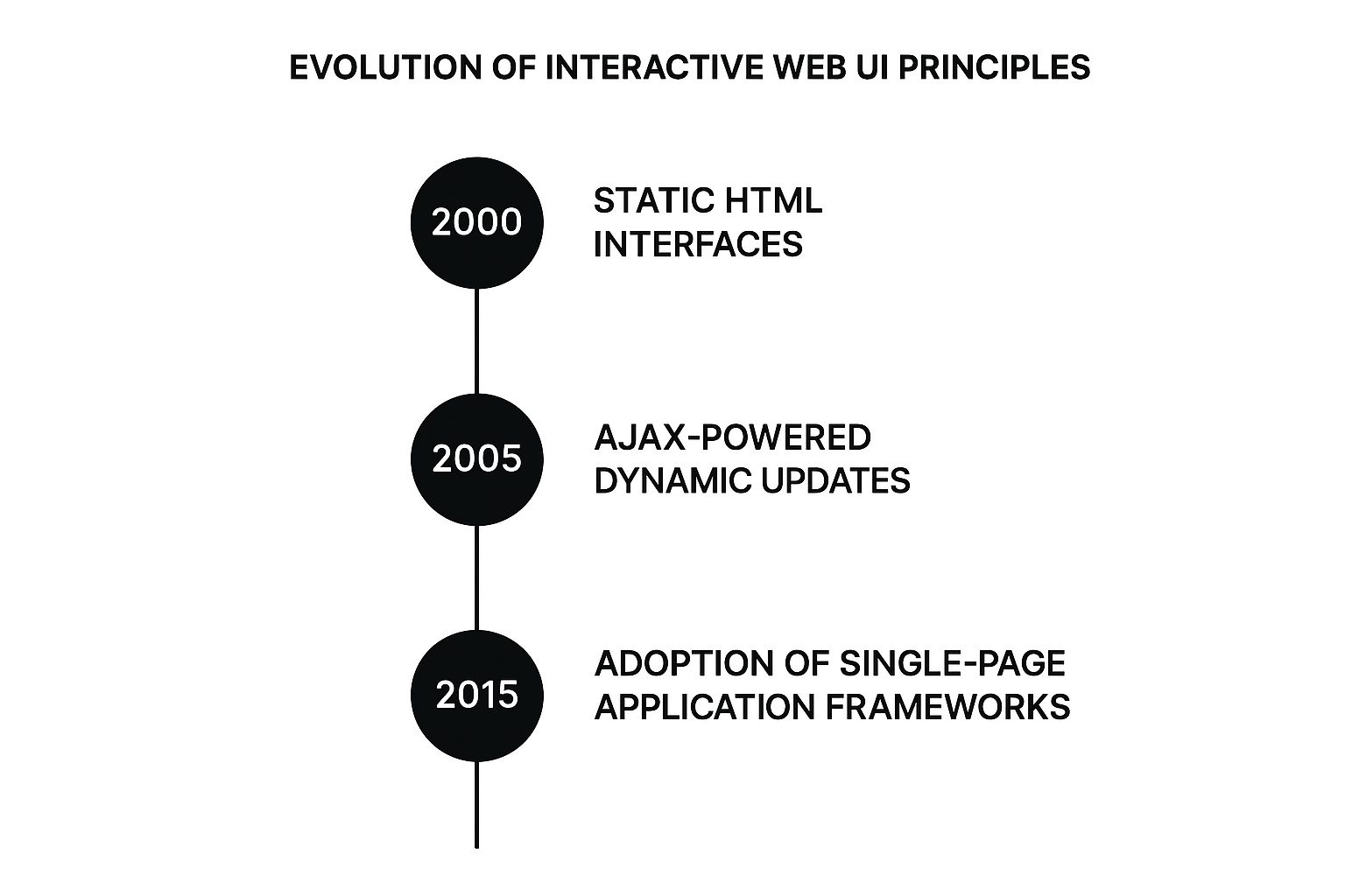
The visualization reveals a clear movement toward more fluid and responsive experiences, where the page updates itself without a full reload. This shift made user interactions feel much more natural and smooth.
The Rise of Dynamic Pages
The mid-1990s was a major turning point as the web moved quickly from static documents to more dynamic platforms. With the arrival of JavaScript in 1995, designers were no longer limited to basic HTML. They could now create pop-ups and flashing elements to grab a user's attention. This era also introduced over 250 web-safe colors, which led to a vibrant, if sometimes chaotic, visual style.
This period of experimentation was essential. Developers were figuring out how to use new tools to capture interest through interaction, not just by presenting information. If you're curious about these early trends, you can explore a detailed history on Visual Fizz.
Key Breakthroughs That Shaped Modern Interaction
Several critical advancements pushed this evolution forward, each one building on the last to create the seamless experiences we now expect.
- AJAX (Asynchronous JavaScript and XML): This technique was a game-changer. It allowed web pages to request data from a server in the background without interrupting what the user was currently seeing. It’s why new posts can appear on your social media feed without the entire page having to refresh.
- Flash: Although no longer in use, Flash was vital in expanding what was possible with web animation and rich media. It showed designers and users the potential for more engaging online content and fueled demand for it.
- Mobile-First Design: The explosion of smartphones forced a total rethink of web design. Designers had to adapt to smaller screens and touch controls, which resulted in cleaner, more direct design patterns that prioritize core functions.
These were more than just technical updates; they fundamentally changed the relationship between people and websites. Today, we expect a constant, flowing conversation with our digital tools, a direct result of these historical steps forward.
Essential Principles That Separate Great From Frustrating
Excellent interactive web design works because it follows a set of invisible rules. When designers stick to these principles, the experience feels natural and smooth, almost like a pleasant conversation. But when they're ignored, the result is a confusing and frustrating journey that makes users feel lost. It’s not about flashy effects; it’s about making every single click and scroll meaningful and predictable.
This process is about building a dialogue based on trust. A user needs to feel sure that when they perform an action, the website will respond as expected. This confidence is earned through designs that communicate clearly at every step, turning a potentially confusing task into a guided, enjoyable one.
Building Trust Through Feedback and Consistency
The foundation of any good interaction is immediate feedback. Think about clicking a button on a website and seeing absolutely nothing happen—no color change, no loading icon, nothing. You'd probably click it again, feeling unsure if the site is broken. This uncertainty creates friction. In contrast, effective design provides instant confirmation for every user action.
- A button can subtly shift color when you hover over it and look pressed when you click it.
- After submitting a form, a loading spinner should appear, followed by a clear success message.
- When you drag an item to a shopping cart, a small visual cue should confirm it was added.
This ongoing communication assures users that the system is listening and has understood their commands. Alongside feedback, consistency is just as important. Interactive elements must behave the same way across the entire website. If a certain style of button opens a pop-up on one page, it should do so everywhere else. This predictability lowers the mental effort required from users, as they don’t have to relearn the site's rules on each new page. A user who feels capable and in control is far more likely to stick around.
To better understand how these principles work in practice, it's helpful to see them side-by-side with common design errors. The table below outlines these core principles, their best practices, and the negative impact that occurs when they are overlooked.
| Design Principle | Best Practice | Common Mistake | User Impact |
|---|---|---|---|
| Feedback | Provide immediate visual or auditory cues for every user action (e.g., hover states, loading animations). | No response after a click or tap, leaving the user to guess if the action registered. | Confusion, frustration, and repeated actions. Users may think the site is broken. |
| Consistency | Use the same design patterns and behaviors for similar elements throughout the site. | Buttons, links, and navigation menus behave differently on various pages. | High cognitive load. Users must constantly relearn the interface, leading to a clumsy experience. |
| Affordance | Design elements to visually suggest their function (e.g., buttons look clickable). | Using flat or ambiguous designs that don't clearly indicate they are interactive. | Guesswork and uncertainty. Users have to hunt for interactive elements, slowing them down. |
| Purposeful Interaction | Ensure every animation or transition serves a purpose, like guiding attention or showing a relationship. | Adding animations purely for decoration, which can be distracting or slow down the site. | Distraction and impatience. Meaningless effects can get in the way of the user's goal. |
This comparison shows that interactive design isn't just about what you add; it's about how you build a reliable and intuitive system. Small, thoughtful details make all the difference in creating a positive experience.
Designing Intuitive and Purposeful Interactions
An interaction should feel so natural that the user barely has to think about it. This is where the principle of affordance is key—designing elements that visually signal how they are meant to be used. A button should look "clickable," and a slider should look "draggable." These visual hints are crucial for intuitive navigation because they remove the guesswork.
Furthermore, every interaction must have a clear purpose. An animation shouldn't be there just to look modern; it should guide the user’s eye, clarify a change on the screen, or smooth out a transition. For example, when an item is added to a cart and a tiny icon animates toward the main cart symbol, it visually links the action to its result. This purposeful movement is much more effective than a simple "Item Added" message.
For example, Stripe uses subtle, clear interactions to guide users through its complex financial tools without overwhelming them.
This image shows how Stripe’s menu uses clean design and understated hover effects to let users know exactly where they are and what their options are—a prime example of intuitive navigation.
Ultimately, the best interactive web design is often the most subtle. It doesn't fight for attention but instead works quietly behind the scenes to make the user’s journey as smooth as possible. By focusing on these core principles—feedback, consistency, and purposeful affordance—designers can craft experiences that feel less like using a machine and more like having a helpful conversation.
Tools That Bring Interactive Designs to Life
Bringing a captivating interactive idea from a sketch to a live website once required wrestling with complex code from the ground up. Today, a fantastic collection of specialized tools empowers designers and developers to build, test, and launch engaging digital products more efficiently. Think of these tools as an artist's brush or an engineer's blueprints; they are what turn abstract concepts into tangible, responsive realities.
These tools generally fall into three main groups: platforms for design and prototyping, frameworks for development, and libraries for adding motion.
Design and Prototyping Platforms
Before a single line of code is written, interactive web design starts in visual environments where ideas can be explored without limits. These platforms are the drawing board where the first conversation between the design and the end-user takes shape.
- Figma: A major player in the design world, Figma is a browser-based tool that’s perfect for everything from simple wireframes to detailed, interactive prototypes. Its real-time collaboration feature is a game-changer, allowing entire teams to work on the same file at once.
- Adobe XD: As a strong competitor, Adobe XD offers powerful features for creating vector-based designs and click-through prototypes. It fits seamlessly into the Adobe Creative Cloud, creating a smooth workflow for designers already using apps like Photoshop and Illustrator.
- Sketch: A long-time favorite for macOS users, Sketch is celebrated for its clean interface and extensive plugin library, which allows designers to tailor their workflow to their exact needs.
Take a look at Figma’s interface. It shows how designers can visually link different screen states to map out and simulate how a user will move through an application.
This ability to visually link screens is what makes prototyping so effective. It gives teams a chance to test the logic and feel of an interaction early on, saving significant time and resources that would otherwise be spent on development.
Development Frameworks and Libraries
Once a design concept is approved, developers step in to build it using frameworks and libraries. These resources provide pre-written code and established structures for common web tasks. This frees up developers to concentrate on crafting the unique, interactive elements that make a site special. The period from the mid-2000s to the early 2010s was pivotal for this shift. The launch of visually-driven platforms like Pinterest in 2010 inspired new design directions, while frameworks like Bootstrap (2011) and JavaScript libraries like React (2013) gave developers the building blocks to create responsive, dynamic user interfaces. You can learn more about this transformative era by exploring the history of web design on bowwe.com.
Animation and No-Code Platforms
For designers who want to add fluid motion to their work without getting deep into code, a new wave of tools has made animation more accessible than ever.
- Lottie: This is a library that allows designers to export animations directly from Adobe After Effects as small JSON files. These files can then be easily added to a website, ensuring the animation looks exactly as intended.
- GSAP (GreenSock Animation Platform): A professional-grade JavaScript animation library, GSAP offers developers precise control over motion, performance, and timing. It's ideal for creating complex interactive stories and sophisticated animations.
- Webflow: This powerful platform effectively blurs the line between design and development. Webflow empowers users to build production-ready websites with complex interactions and animations through a visual interface, all while generating clean HTML, CSS, and JavaScript in the background.
To help you decide which tool might be right for your next project, here’s a table comparing some of the most popular options available.
Interactive Design Tools Comparison
A comprehensive comparison of popular tools for creating interactive web designs, including their strengths, learning curves, and best use cases.
| Tool | Best For | Learning Curve | Pricing | Key Features |
|---|---|---|---|---|
| Figma | Real-time collaboration, prototyping, UI design | Gentle | Freemium model with paid tiers | Browser-based, robust vector tools, auto layout, extensive plugins |
| Adobe XD | UI/UX design, prototyping, vector editing | Moderate | Part of Adobe Creative Cloud subscription | Seamless Adobe ecosystem integration, repeat grid, 3D transforms |
| Sketch | UI design for macOS users, building design systems | Moderate | Subscription-based | Strong plugin ecosystem, clean interface, symbols for reusable components |
| GSAP | High-performance, complex JavaScript animations | Steep | Free core with paid club plugins | Fine-grained animation control, excellent performance, cross-browser compatibility |
| Webflow | No-code web development, building production sites | Moderate to Steep | Freemium model with site and account plans | Visual CSS grid, built-in CMS, production-ready code export |
The best tool ultimately depends on your project goals, your team's skillset, and your budget. By mixing and matching prototyping platforms with the right development and animation tools, creators can build polished interactive web design that not only grabs attention but also delivers a truly memorable user experience. For more software recommendations, you can see our guide on the best tools for modern web creators.
Real Examples of Interactive Design That Delivers Results
Theory is great, but seeing interactive web design in action is where the ideas truly click. By looking at real websites that successfully pull users in and achieve clear goals, we can understand what works and why. These examples show how thoughtful interactions are more than just decoration; they are strategic tools that serve specific business needs, from building trust to making complex decisions feel simple.
When we break down these digital experiences, we can move beyond admiration and start to grasp the strategy behind each choice. This process shows how small design decisions can have a big impact on user behavior and, in turn, a company's success.
Spotify: Curating Discovery Through Play
Spotify's appeal isn't just its massive music library; it's also a masterclass in interactive design. The platform makes finding new music feel like a game rather than a chore. Features like the "Discover Weekly" playlist, which uses algorithms to suggest personalized tracks, create the feeling of having a personal DJ dedicated just to you.
The interface itself is full of intentional interactions:
- Hover Effects: Move your cursor over a playlist, and the cover art gently grows larger as a play button appears. This small cue keeps the interface clean while making the next step obvious.
- Drag-and-Drop Functionality: Building and organizing playlists is a breeze. Users can simply drag songs into their custom lists, an intuitive action that feels as natural as arranging physical objects.
- Visualizers: The real-time audio visualizers add a dynamic, sensory layer to listening, making the experience more captivating.
These elements work together to make you feel like you're actively building your own music world. This feeling of ownership and personal connection is a powerful way to keep users coming back. The whole experience is less like searching a database and more like a fun, interactive adventure.
Airbnb: Building Trust at Critical Moments
For a platform based on staying in a stranger's home, trust is the most important currency. Airbnb uses interactive web design to build this trust with well-placed micro-interactions, especially during the booking process. The design anticipates a user's worries and offers reassurance every step of the way.
Consider how Airbnb handles the search and booking flow. The interactive map updates in real time as you pan and zoom, immediately displaying available properties and their prices.
The screenshot shows the direct link between the map and the property listings, letting you visually explore a neighborhood while your options update instantly. This interactive connection between location and lodging gives you a strong sense of control and clarity, making a potentially stressful decision feel manageable and even exciting.
Furthermore, when you select dates on the calendar, the site instantly calculates the total cost, including all fees. This upfront interaction prevents unwelcome surprises at checkout and strengthens the perception that Airbnb is a trustworthy platform. This focus on clear communication through interaction is a major reason why millions of users feel comfortable booking through the site. By seeing these top-tier designs, you can get a better sense of what's possible; for even more inspiration, you can explore some outstanding interactive web design examples that push creative boundaries.
Proven Methods for Implementing Interactive Elements
Bringing an interactive web design idea to life isn’t just about a spark of creativity; it requires a structured and repeatable process. Turning a concept into a polished, functional element involves careful planning, design, and execution. This approach makes sure the final interaction actually improves the user’s journey instead of just adding a distracting animation. A solid method helps you find the right balance between creative vision and technical limits, resulting in designs that are both engaging and effective.
The process kicks off long before you open any design software. It starts with getting to know your user on a deeper level. Without this initial research, your interactive elements are built on guesswork, which often creates features that are confusing or irrelevant. By anchoring your design in real user needs and behaviors, you can build elements that feel natural and genuinely helpful.
The Foundation: User Research and Prototyping
Before you even think about building an interactive feature, you need to ask: "Who is this for, and what problem does it solve?" User research is how you find the answer. This means gathering information about your target audience's goals, frustrations, and technical skills through surveys, interviews, or by analyzing how they currently use your site. The aim is to paint a clear picture of the user so every interactive element serves a specific purpose for them.
With that foundational knowledge in place, the next step is prototyping. A prototype is an early, testable version of your interactive idea. It doesn’t have to look perfect; its job is to confirm your idea works before you pour resources into full development.
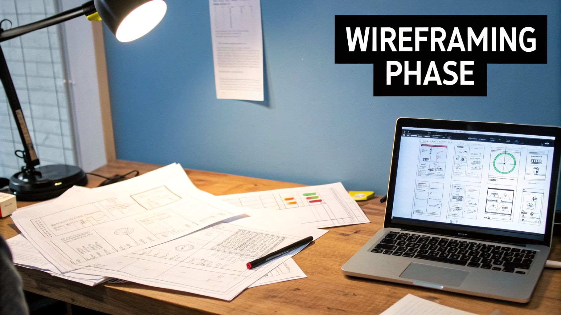
- Low-Fidelity Prototypes: These can be as simple as sketches on paper or basic wireframes. They help you quickly outline the user flow and test the basic logic of an interaction without getting lost in visual details.
- High-Fidelity Prototypes: Created with tools like Figma or Adobe XD, these are more detailed, clickable models that look and feel much closer to the final product. They let you test specific animations, transitions, and interface elements with real users to collect feedback.
This cycle of research, prototyping, and testing is vital. It helps you find and fix design flaws early, adjust your concept based on actual feedback, and make sure the final product puts the user first.
Technical and Accessibility Considerations
A fantastic interactive concept can quickly become a disappointment if it performs poorly or excludes certain users. Technical performance is a huge part of the user experience. An animation that lags or a feature that loads slowly will cause frustration and might even drive users away. To prevent this, it's critical to optimize assets like images and videos and write clean, efficient code. Performance should be treated as a core feature, not an afterthought.
Just as important is accessibility. An interactive design is only truly successful if everyone can use it, including people with disabilities. This means designing for accessibility from day one. Key things to consider include:
- Ensuring all interactions can be navigated using only a keyboard.
- Providing descriptive alt text for images.
- Making sure animations don't cause motion sickness.
- Using enough color contrast to ensure text is readable.
Web development resources provide a wealth of information on building accessible experiences. For instance, the Mozilla Developer Network is a key resource for web standards and offers clear documentation.
This shows how fundamental resources give clear instructions for building inclusive web features, ensuring no user is left out. Prioritizing performance and accessibility early in the process leads to more robust and welcoming interactive experiences. You can explore more practical guides and tutorials in our full list of web development resources.
Measuring Success and Ensuring Compatibility
Once an interactive element is live on your site, the job isn't done. You need to measure its impact to see if it’s meeting its goals. With analytics tools, you can track key metrics like:
- Engagement Rate: Are people actually using the element?
- Conversion Rate: Does the interaction lead to more sign-ups, sales, or other key actions?
- Time on Page: Is the feature encouraging users to stick around longer?
This data gives you solid proof of what’s working and what isn’t, helping you make smarter decisions for future updates. Finally, you must ensure your design works smoothly across different browsers and devices. An amazing interaction that’s perfect on a desktop but broken on a mobile phone is a failure. Cross-device compatibility is essential for reaching the largest possible audience and providing a consistently great experience.
What's Next for Interactive Web Design
The world of interactive web design is always advancing, driven by new technologies and changing user expectations. The future is moving toward experiences that feel less like operating a machine and more like a natural part of our daily lives. Interaction is breaking away from the classic clicks and taps we have used for decades.
This change means designers are now figuring out how to create more intuitive, human-focused conversations. Instead of users needing to learn an interface, the interface is learning to understand the user. This establishes a more direct and seamless link between a person and a digital product.
The Rise of More Natural Interfaces
While the keyboard and mouse have been reliable tools, the next wave of interactive design looks beyond them. We are now exploring more instinctive ways to engage with web content.
- Voice User Interfaces (VUI): Speaking is often quicker and simpler than typing. As voice recognition technology improves, websites are beginning to add voice commands for searching, navigating, or completing forms. This makes the web more accessible for everyone, especially those who find typing challenging.
- Gesture Controls: Imagine using hand movements, captured by a device’s camera, to control a website. You could swipe through a photo gallery in mid-air or pinch to zoom on a product without ever touching the screen. This kind of interaction feels immediate and compelling.
- WebXR (Extended Reality): This technology integrates augmented reality (AR) and virtual reality (VR) directly into the web browser, eliminating the need for a separate app. A furniture store could let you use your phone's camera to see how a new sofa fits in your living room. A museum could provide a virtual tour directly on its website. These are practical, immersive experiences that were once out of reach.
These developments aren't just technical novelties; they are responses to a growing need for technology that adapts to our behavior. You can see these ideas in action on platforms that feature pioneering work.
For instance, Google's platform for experimental projects displays a variety of forward-thinking interactive concepts.
This gallery of experiments shows how developers are using AI, AR, and other tools to build web experiences that are not only interactive but also intelligent and aware of their context.
AI-Powered Personalization and the Internet of Things
Artificial intelligence (AI) is another major influence shaping the future of interactive web design. AI allows websites to shift from delivering the same content to everyone to creating deeply personalized experiences. For example, an e-commerce site could use AI to learn your style preferences and present a curated collection of products as soon as you land on the page. This is more than just showing recently viewed items; it’s about anticipating your needs before you even think to search.
Furthermore, the Internet of Things (IoT) is pushing the definition of a "website" beyond the computer screen. Your smartwatch, your car's dashboard, or even your smart refrigerator could become interaction points for a web service. This means interactive design is no longer limited to a browser window. Designers will have to consider how an experience flows across multiple devices and situations throughout a user's day.
Keeping up with these trends is important. The objective isn't just to add new technology for the sake of it, but to understand how it can solve real user problems and forge more meaningful connections. By focusing on creating experiences that put users first, designers can make sure their work stays relevant and effective as technology continues to evolve.